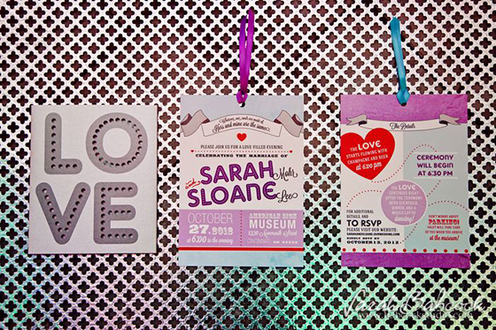
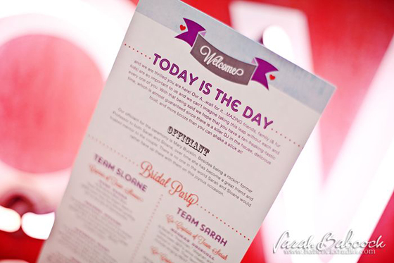
Sarah and Sloane’s wedding invitation design is right up at the top of my list of favorites. And, while the design itself is fabulous, there are several more reasons why this projects rocks. I was given complete creative freedom, in coordination with Rachel Murphy, wedding planner extraordinaire. Together, we decided that a die-cut pocket of sorts would make this invite pretty rad. And, we were right! Special touches like that are always fun.
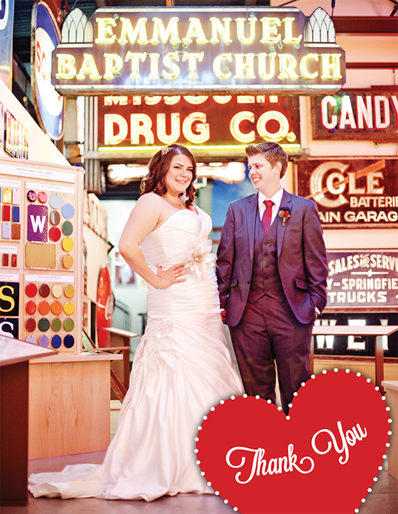
Another reason why I love this project is because the couple is so great. They chose a super-cool venue, The American Sign Museum, in Cincinnati. If you haven’t checked it out yet, it’s totally worth a visit! The main directive from them right off the bat was to have fun and when that’s the priority, you just can’t go wrong!
And finally, this is my first time designing an invitation for a same-sex couple. And to avoid going off on a tangent about that, I will simply say that Cormier Creative is all for people being happy, people being themselves, people being in love, people who are awesome, people who are real and people living their dream.
Thank you to Sarah Babcock Wedding Photography Studio for the lovely images!


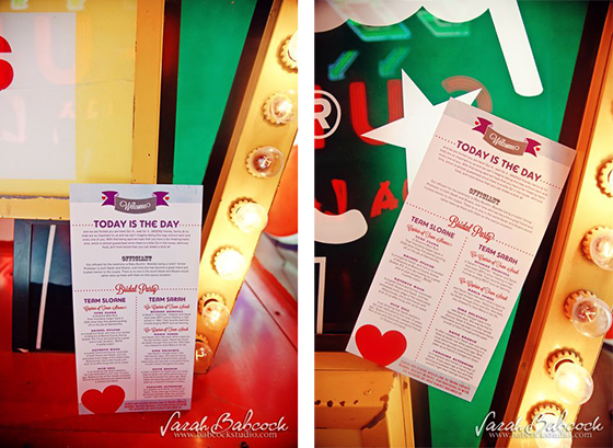

These are so fun! What a great theme for invites/wedding pub!